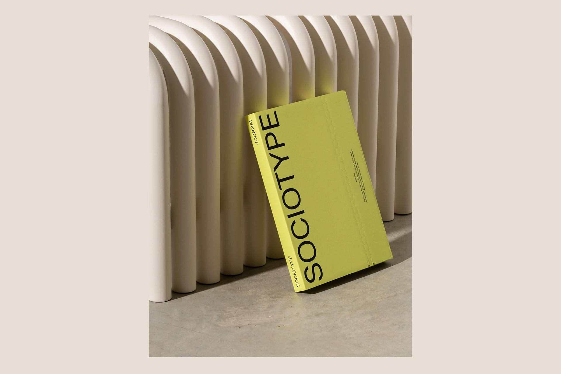
Sociotype Journal issue two blends typographic design with stories of human ingenuity
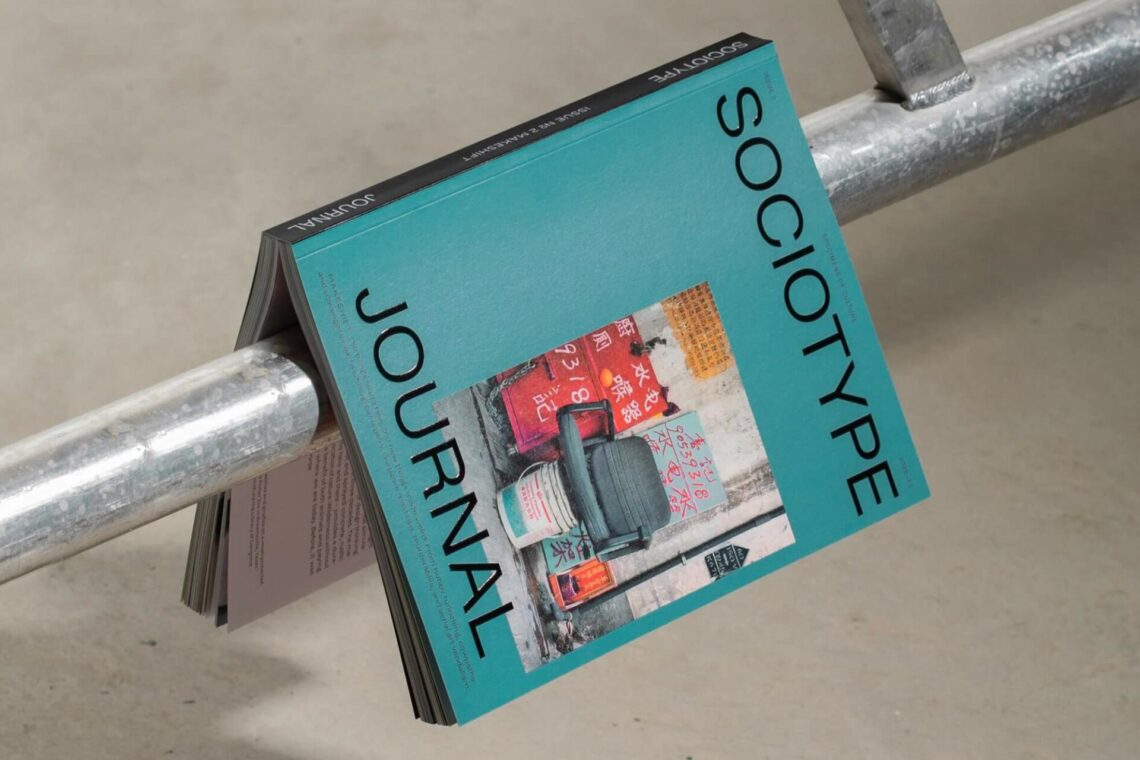
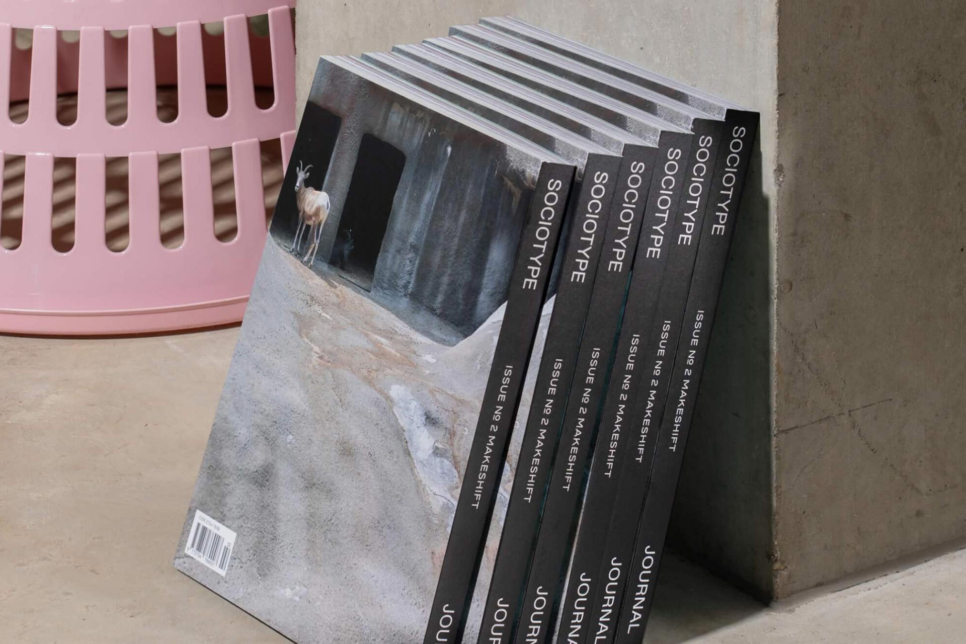
Sociotype Journal is back with their sophomore issue, this time themed upon ‘Makeshift’. The type specimen magazine is a journey through culture, working across many different stories from across the globe. Focused on the typeface ‘Rework’ – the “superfamily” from this font works to add weight and clarity to these diverse narratives on show in issue 2. In 2023’s D&AD Awards, the issue won the Graphite Pencil in the category of Magazines and Newspaper Designs, a coveted prize in the design world.
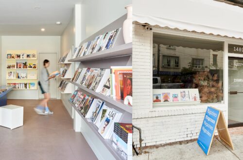
Aimed at “designers who like to read”, Sociotype Journal blends cultural stories with engaging editorial design, whilst being a showcase for their very own ‘Rework’. Clocking in at 240 pages, it features twelve essays, seven image-led articles and a twenty four page technical type specimen. The paper stock is heavily considered throughout, adding a tactile journey to the pieces – from thick paper stock for the main bulk of the magazine, to thinner, glossy stock for highlighting photo-led articles. An example of the switch of stock is the ‘Concrete Jungle’ piece whose red headline page is on the thicker paper, whilst the rest of the content sits on the glossy. The difference creates a notable change in the reading experience – as though it signals the start of something new.
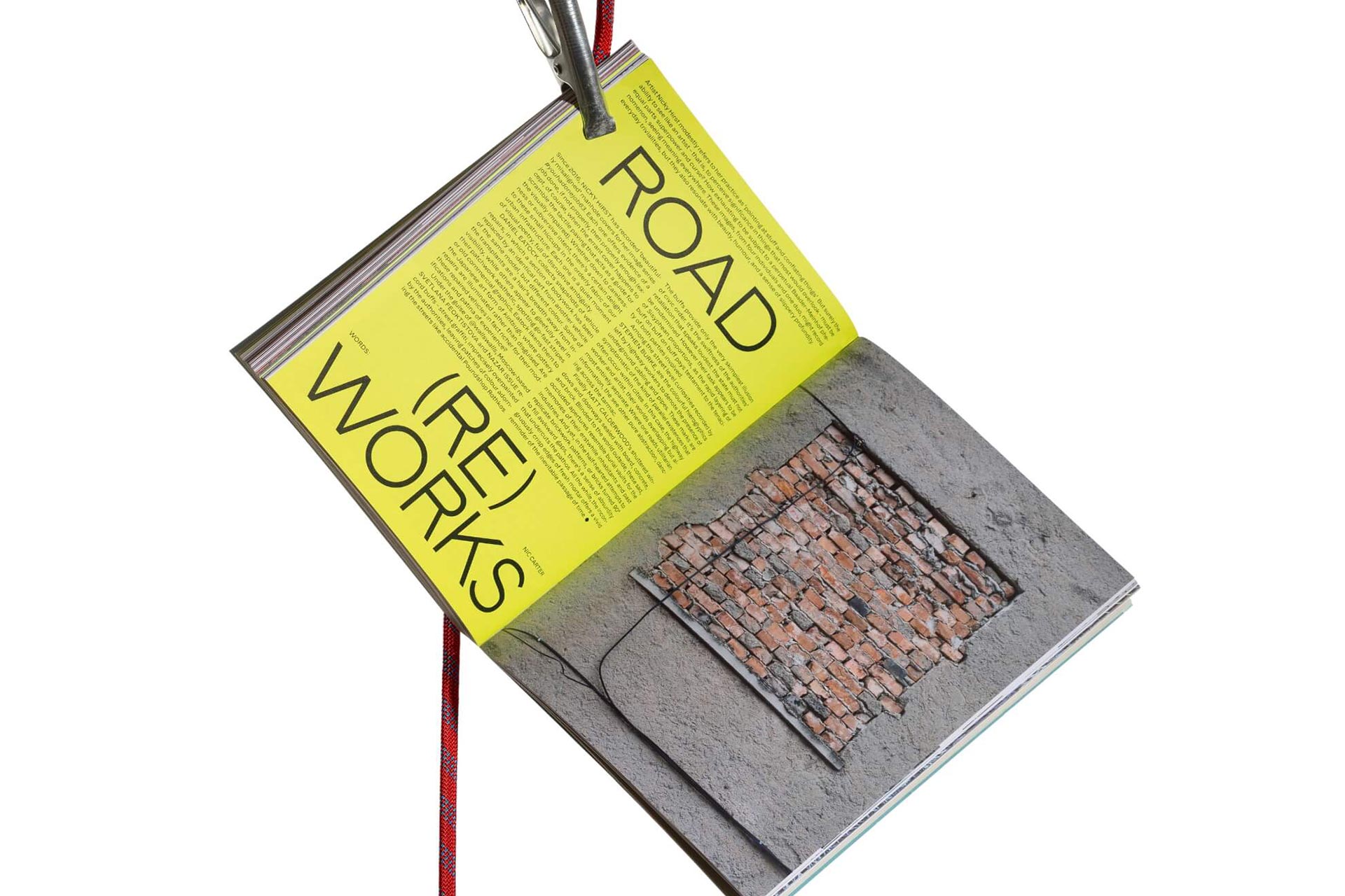
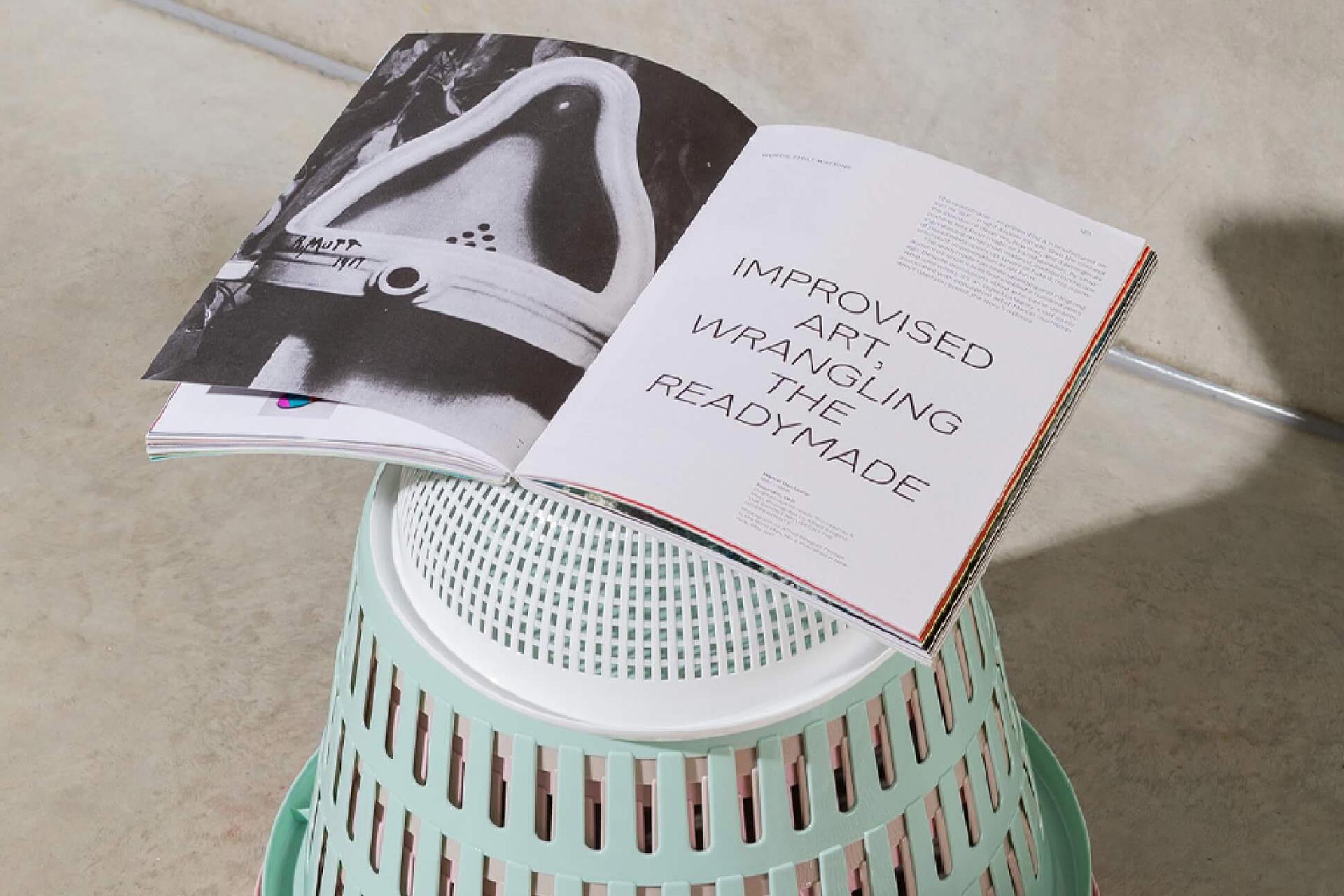
Each article within issue 2 seamlessly runs into one another with no adverts, as is common for independent magazines. In their place are strong typographic cover pages on sometimes vibrant coloured stock to signal that new beginning – a chapter marker. Without this each piece will miss a part of its identity and within Sociotype this is a place to be creative and experimental with ‘Rework’ and its ability to strengthen the written message. Their magical use of white space gives each piece availability to breathe and become easily digestible. The mixture of full page imagery is balanced with various grids for smaller highlights – with fashion articles using the full space available to create a thumbnail universe. We see this relatively often within Sociotype Journal issue 2, but it’s the ‘Why do men dig?’ Article that flips the layout into a quarter imagery and three-quarters text, with the imagery lining the bottom edge of the pages. The images are notably historical in context and therefore gives them a timeline or even film strip montage look.
The content within the journal is as surprising as it is fascinating. Human ingenuity is at the forefront of the content and interlinks with the theme of ‘Makeshift’, inviting us into different conversations from the world of Alvar Aalto, upcycling artists, the ‘Mole Man of Hackney’ to a dynamic use for chairs in ‘Out the back’. On page 100, Emily Watkins wrote, “We produce art to make sense of the world,” in an article enveloping prison and space artistry with tattoo stigma. The quote is a strong description for the content in this issue – and Emily’s piece is homage to humans continuing to be creative even in the most demanding of circumstances. This is in relation to Donny Johnson, a prison inmate who has lived half of his sentence so far in solitary confinement. Donny used his time to create paintings with his own hair as a makeshift brush and has even gone on to have a travelling exhibition whilst still incarcerated.
The eclectic collection of stories bring the reader to far reaching places but hones in on the huge level of intrigue that underpins each piece. In ‘B Sides’ we meet George Eksts and his side job at the V&A. Usual pieces coming out of the museum promote the latest exhibitions or upcoming installations, etc, but George’s story is an unusual insight into a project named the factory project and is an archival effort. The huge effort consists of recording their collection of drawings, prints and paintings – but along the way have found a few surprises on the back of the artwork. Sometimes unveiling a work in progress or first draft of a piece, or even fully fledged watercolours. There is an air of mystery and fresh intrigue surrounding what’s unveiled in George’s project – one that is being shared across social media and print in a different age from whence the work was made.
Crafting a journey through a magazine at this scale can be as easy as serving piece by piece without breaks – ultimately serving long form pieces that run until the end. But Sociotype has a twist to this flow which holds pieces of poetry, running through the magazine, woven into the narratives like a tapestry. The so-named ‘Existentialist google search poetry’ is continued throughout the entirety of the magazine, adding snippets between sections. One of the layouts includes the words ‘Why am I triggered by rejection, why am I triggered by loud noises,’ and continues. This is overlaid on an Edvard Munch piece from 1892, holding a visual driven by this existentialism, so it appears. These cut-out winding words breaking up the articles offer fun antidotes – a random collection of modern fears to a lack of understanding.
This lack of understanding is how Sociotype Journal ties in with Makeshift as a theme. It holds as many questions as it does answers in regards to human action, and contains examples of human initiative and also levels of disparity. We can quantify these actions by the identification of the underlying inventors within us all. Be it digging holes to become underground lairs, to chopping off chair legs to balance them on stairs and solid ground (or buckets as the front cover suggests). The magazine holds dear what humans have always done and will continue to do – invent with the tools and materials we have around us to shape the environment we’re in. To the beholder there is a clear link between ingenuity and invention, but there is always that underlying narrative of the unknown that sprinkles a desire to learn more.
Overleaf recently interviewed Nic Carter regarding the release of issue two. You can read the full interview below.
How did the theme Makeshift come about?
Sociotype is a digital type foundry first and foremost, so the idea for the Journal was to typeset each issue in a different type family, the characteristics of which inspire the theme of the issue. Our second issue, Makeshift, was set using Rework, which is a kind of historical hybrid – a Frankenstein’s monster of influences from different periods and different media, including carved stone, hot metal type, copperplate engraving and phototypesetting. It has a slightly cut’n’shut feel, like one Daniel Eatock’s cars with the different colour body panels. When we were planning the issue, the theme of improvised creativity felt like it would be a fun thing to explore.
Issue two seems to highlight our existential fears as a human race but also presents us with tangible, uplifting stories. Do you think that these co-exist to help us progress?
Issue two features a number of examples of mending or adaptation; of people making weird and extraordinary things, not necessarily for the sake of creative expression, but simply in order to get by, to prolong the useful life of a object. That these things exist are at all is often the result of poverty or, in the case of the improvised personal protection created by street protesters, political disenfranchisement. But we can certainly take hope from the ingenious ways in which people with very few resources have found to cope with their difficult circumstances.
There’s also the idea explored so movingly in Celia Pym’s work, that we might be able to change our relationship to the things we own (and reduce our consumption in the process) by shifting our perception of the point at which useful objects become junk. This is of course a highly subjective and culturally-dependent view anyway, which is in part what makes Michael Wolf’s images so beguiling to privileged Western viewers.
"Our third issue will feature our grotesk Onsite, which has three widths. It’s been a greater challenge to design the issue, as there’s a more significant difference between the three widths than there is between the optical sub-families of Rework or Gestura, which we used for issues one and two."
Nic Carter, Creative and Editorial Director at Sociotype Journal
Rework in action is a great showcase of what you do as a foundry. Did you discover any surprising elements or nuances when using the font?
We thoroughly test each type family we produce while it’s developing, but the Journal is our first opportunity to really put the whole family through its paces. Rework is quite an unusual family, in that the upper and lowercase were inspired by different references, so they have quite distinct personalities when used separately. This gave us quite a lot to play with when designing, particularly for the opening spreads of each article, where we use type at a larger scale.
The use of a modern sans-serif upon historical photographs is an interesting contrast – almost giving fresh life to the photos. How did you approach the creative direction?
There a practical reason, which is that many of the images we use are in the public domain, and high quality historical content tends to be more readily available. Plus from a designer’s point of view, we can exploit the potential for visual tension between historical material and contemporary typography.
And then editorially, because we publish a new issue of the Journal roughly every 12 months, we knew from that start there would be no point in trying to cover similar ground as other monthly or quarterly magazines. So we’re not aiming to present novelty, but attempting to connect things we think are worth consideration, in order to shed new light on them. I suppose it’s a museum-like approach: creating connections across points in time and from different points in culture. That might be by connecting the temporary architecture of contemporary protest camps to the Communard uprising in 19th century Paris, or the accidental poetry of Google predictive search to the romantic notion of artistic ennui.
How was the curation process in regards to choosing the pieces to feature?
We draw up a list of potential themes for articles and assess which are the most promising. It’s quite an intuitive process. Does it pass the sniff test – ‘would I want to read this?’ and ‘does this resemble something that would feature in another magazine?’. If an idea feels original enough and seems like it has promising visual material to support the writing then it goes onto a shortlist.
Some pieces take the form of quite straightforward reports, while others feature strong opinions or require more of a leap of imagination from the reader. I think the most successful articles are those that pull together things that don’t naturally fit together, like the secret hand gestures of the Illuminati and West coast gangs in issue one, or like pairing up the kindred spirits of two tunnellers, the Mole Man of Hackney and Elon Musk, in issue two.
Overleaf email newsletter - subscribe for free today!
Get indie magazine news, reviews and events direct to your inbox! Simply sign up below and you’ll be the first to hear about new articles, podcast episodes and loads more.
The alternating paper stock gives the reader a more tangible experience – can you describe the creative process behind the paper choices?
Like most designers, we spend much of our lives looking at screens and most of what we produce lives onscreen. We don’t often get the opportunity to design for print, so we wanted to give readers a tactile experience as well as a visual one. There are four different paper stocks in each issue. We use uncoated stock for the essays and glossy stock for the image-led articles. Then we use a light weight coloured stock for the technical type specimen at the back and a textured, semi-coated stock for the cover. Using different stocks makes planning the sections a little more complex, but it’s an important reminder for us as we develop each issue to think of the Journal as a physical object, rather than a two-dimensional thing.
The recurring poetry piece gave the sections a feeling of freshness but also a comedic break. The randomness of the work presents us with less definitive narratives – is this something you’ll continue in future issues?
Sure, we like a certain feeling of randomness (although it’s actually not random – perhaps tonal promiscuity would be more accurate?). The Google poetry came from a desire to reinterpret readymade content from unusual platforms. For issue one we featured a selection of people’s Twitter reactions to David Shrigley’s Really Good (the 7m high bronze fist giving a grotesquely extended thumbs up from Traflagar Square’s Fourth Plinth). The comments were so mundane and funny. We might raid another platform for a future issue. I quite like the idea of taking reviews from TripAdvisor or Amazon.
Our day job (design agency SOCIO) constantly puts us into novel situations where we have to learn about industries or groups of people very quickly. Planning the content for the Journal similarly requires not just one steep learning curve, but many – we’re not experts on any of the things we write about, but we’re pretty good at researching and quickly filtering out the aspects of a topic that we find interesting and can build a narrative from. Not being experts, nothing we present could hope to be in any way definitive and we don’t presume to have any answers for our readers. But we try to present things in a way that stimulates thought.
Sociotype is released once a year and is set in only a single typeface (a superfamily). Do you think you’ll look to feature duo-typefaces in the future?
We’ve certainly discussed it. Of course it depends upon the rate we release new type families. We’re a small team and each of the type families we’ve produced so far feature over 40 styles, so there’s only so fast we can go. Our third issue will feature our grotesk Onsite, which has three widths. It’s been a greater challenge to design the issue, as there’s a more significant difference between the three widths than there is between the optical sub-families of Rework or Gestura, which we used for issues one and two. This prompted us to redefine the design approach a bit, creating greater diversity in typographic style between articles. It’s required more work, but it feels like a step forward. You’d expect me to say that I think issue three will be our best yet, but it will be. And it’s certainly more effective in its role as a type specimen.
The stories include a mix of light-hearted human history (digging underground), to creativity (upcycling) and murderous artefacts. Was this level of representation and depth across the theme important to you?
One of the advantages of basing an entire issue on a single theme is that it allows us to stretch the tone of the content further – we can afford to be both serious and a bit silly in places and it still hangs together under the central theme. I suppose varying tone like that just seems like the most natural approach – life is serious and silly and beautiful and ugly all at the same time. And the juxtaposition of high and low content can be very effective. Like the piece about amateur art conservation and vandalism, which places Monkey Christ and the Salvator Mundi side by side. An article about either one of those wouldn’t be as interesting as an article on both.
How long does the magazine take to make and where is it made?
Each issue takes between six and nine months to research, write and design. We put together the Journal alongside our studio work at SOCIO and Sociotype. We’re a busy studio, so because we don’t have any commitments to a publisher or advertisers, we work on it when we can. There’s been a bigger gap between issues two and three because we’ve been very busy on other things, but we’re planning to get back to a more regular schedule for issue four. We print in the UK, down in Kent with Identity, and with generous support from our paper supplier, Fedrigoni.
How does it feel to be a graphite pencil winner at the D&AD Awards?
It feels pretty great. And it was a real surprise. There were so many other worthy nominees, we were very happy just to be shortlisted. To win was just unreal. It’s gratifying to receive recognition for trying to do something different with a type specimen. The idea that type needs content to communicate effectively is hardly radical, but it feels like swimming against the tide of most Content (in modern digital sense of the word). Each type family we create requires hundreds of hours of work, so it would be a huge shame to showcase the result of all that effort by using content that’s doesn’t match up. We’re all guilty of a little tsundoku, but I hope the Journal is one that most people who receive a copy will actually read.
Where to buy
Here are the stockist websites for this magazine title. These may include social media links only.
Sociotype Journal – Official Website
Correct at time of writing.

Enjoying Overleaf?


You May Also Like
Terra Firma magazine set to launch 2023 diary at London event
October 12, 2022
The Floating Magazine’s posterzine is an ode to activism and creativity for the greater good
July 12, 2022