Plastikcomb magazine issue seven offers an inspiring insight into the world of collage
Plastikcomb magazine issue 7 holds a precious position in today’s printed landscape – one of experimentation and bravery in design. With diverse typographic layouts and strong collaborations throughout, the articles come to life with a youthful vibrance. Now on its 7th edition, the German-American art and design themed publication continues to hold the mission of taking us away from screens. With this being said, their engaging content, design and layout sensitivities allows for the reader to explore and lose themselves – removing them from the digital world.
Leafing through any issue of Plastikcomb, you can’t help but be brought back to the time of Ray Gun and Transworld Skateboarding magazines – all holding an important part of graphic design history – an era heralded by David Carson. The self-taught graphic designer famously started an era of grunge and experimentation in design during the eighties and nineties – taking creative ownership of multiple magazine titles, adding his own stamp on the content. Notably on Plastikcomb’s website we see a quote by graphic designer, speaker and all round creative powerhouse Stefan Sagmeister. Referencing his words on social media, he writes, “I think it’s fantastic that two designers with no formal training are creating a magazine. If you go back in design history, you’ll see that your results are quite similar to what David Carson achieved in the eighties and nineties with Beach Culture and Raygun. As the eighties are being mined for a comeback in fashion and music, maybe we are ripe for this happening in graphics as well.”


Trends apart, Plastikcomb, or PCM as they’re known, holds their own in the printed space. Each issue is packed with interviews and prose with a variety of names in the art and design space. The cover for issue 7 is a collage piece by The Scissorhands, who is also interviewed later on in the issue. Precision papercuts of what seem to be fabrics overlay a core photograph of a person – potentially female, kneeling on a shaggy carpet in fishnet stockings and yellow boots adorned with brooches. The warm yellow and sepia hues from the carpet and the wall offer an inviting palette which almost ties into nostalgia. With cover notes, editor letter and collaborators listed in the first spread, the inside cover previous contains a serving plate separated with potato on one side and a mushroom stew on the other. A logo of a pig with a chef’s hat on is placed around text in a repeat pattern behind the food imagery. We see something similar on the adjacent page, on top of a blue and green striped pattern. This time we see multiple plates of food, potentially indicating page one and page two respectively. But this is the last time we see food art directed in such a way in the issue – other than the back inside cover, as we dive into the world of experimental graphics.
With each piece as diverse as the last; collages of imagery, pattern, type and shape segment each interview. Abstract artist Maki Sato answers Teri Henderson’s questions in the first major piece. Overprinted text similar to that of photocopiers or fax machines bring texture to words across the interview, even flipping segments of answers vertically so readers must turn the magazine to read. That area of tangibility is evident across PCM and even in Maki’s own work. When asked the length of production of their work from start to finish, Maki answers, “If I’m doing well, it’s 3 hours, if it’s not, it’s 3 days, or if it takes longer, the work is a failure (in my case).” The tone of the piece is also punctuated by the colours used. For example, when asked about influential artists, Maki references Rothko – with the entire double page spread using a deep Rothko red with black text overlaid. This homage to the words is especially poignant as this is in direct correlation with their slogan, “melding art with design.”
"With this being said, their engaging content, design and layout sensitivities allows for the reader to explore and lose themselves - removing them from the digital world."
Stuart Williams, Owner of Overleaf
Overleaf is now on Substack!
Get indie magazine news, reviews and events direct to your inbox! Simply sign up to the Overleaf newsletter on Substack and you’ll be the first to hear about new articles, podcast episodes and loads more.


We cut the first interview with the word ‘BEER’ cut in half by a collage overlaid on top of the first half of the word. The rounded text with an obvious ink printed style adds a distressed look to the page, something that is used across a lot of PCM spreads – even the back cover has a faux creased and ripped look. We continue into a piece with Bob Aufuldish, a partner in design firm Aufuldish & Warinner. The first section of the piece is positioned in a tight column of text positioned within a larger image composition. The image is mostly block colour with a rich blue and a few layered paper cuts sitting across the spine of the magazine and the adjacent side. There is a rough look about them – a handmade look, similar to the spread that follows where you can even see some cutting lines.
The rules of typography don’t apply in PCM, and this is how each spread is decisively different from the last. “Remember – no computers, no internet,” Bob notes. This is a crucial statement and relates heavily to the analog style of design across the PCM current catalogue of issues. But it’s Bob’s use of photography as a key component in his work that sees a different type of solution than solely papercutting. Photocopying and letterpressing were also major methods used by Bob in forming an inexpensive process of production. “[Photocopying was] simpler, more physical and less expensive.” Without the internet there was no choice other than to find solutions to produce the type of outcome designers wanted. From dry-transfer Letrasets to typewriters, achieving an analog feel can enhance collage pieces and type work. In the piece by Eric Heiman from Volume Inc, Eric has a step by step process of some crucial design advice. Point one for example, leading with “design is just language” is shown in a typewriter style font – looking overprinted and then edited by hand. On the opposite side we have much larger text with heavy texture, adding a higher visual impact to some well-known slogans in the design world, but with Eric’s own twist. “Form follows purpose” is central to the three slogans, but includes “function” with a line-through above “purpose” – referencing the original slogan “Form follows function.”
Textures in Eric’s piece remind of overhead projector print-outs, photocopiers and analog printing processes. With 9 steps in total there is a complete visual story across the piece, keeping a black and white style across each spread. The piece almost feels like we get access to Eric’s own notebook at the creative agency – his own opinions and advice from a wealth of experience. Predominantly landscape, the article that follows works with orientation to create a compelling visual interview with Mario Zoots, an artist out of Denver, CO. The recorded chat with PCM’s Founder and Editor-in-Chief Aaron Beebe dives into Mario’s beginnings and the process of exhibiting early on in the conversation. Including artwork by Mario embedded into the text, the design aims to wrap around most of them with text whilst subtle additions of grunge elements feature throughout.
“Rauschenberg has been a significant influence on me since early on,” Mario notes. “I found his work so inspiring; it was like, ‘Wow, you can do that kind of stuff?’” This revelation in the art of collaging helped Mario discover a new way of working – starting with copying the artists’ methods. “I was copying Rauschenberg because I wanted to achieve that level of artistry.” But since this early discovery, Mario has gone onto holding exhibitions in places such as Mexico City and Amsterdam. The work in the piece focuses on his collages along with some sculpture, but it’s the prints on silk that Mario references in answer to the “weirdest and craziest material that you’ve ever used” line of questioning from Aaron. Mario notes, “creating a collage, scanning it, and then printing it on silk was quite unusual for me.”
Keen photographer Jack Felice is also featured in PCM 7. A large chapter title of his name is featured in a double page spread to open the article. Its inviting, surf-inspired typography overlays a beach scene that is reversed across one page to the other. Coloured boxes with small white borders look like pieces from Tetris that have yet to have found a place, but at the same time are balanced across the spread. The photography and graphical shapes are a sign of what’s to come in Jack’s piece, whereby a core style of modular shapes are evident throughout the work featured. Beneath images of a person made from ripped paper and collage – almost looking crime scene-esque, Jack discusses the value of mistakes. “In my opinion, the best moments of creating anything are the times when you surprise yourself with a great mistake.” But with a diverse portfolio of work ranging from illustration, paper cutting and photography, the pieces have an air of control but unpredictability about them. This could also be due to the source material, as Jack notes. “I’ve recently been using old Esquire and Playboy magazines from the 50s and 60s.” With only the “bones of the pages left over”, he goes on to mention that he tends to hop between magazines for the material. This means a lot of the source material isn’t infinite and you’ve got to use what you have available – ultimately working with the idea that each piece is a one-off.
Plastikcomb magazine is as unique as these collage pieces – except instead of being a one-off, issue seven tells us a brand new story of creativity. PCM looks to start the narrative between the magazine and maker – a seamless relationship that transcends the paper it’s printed on. Exploring how multiple creatives work on a daily basis in their practices opens up the world of collage to us, but also helps us understand the act of handmade work. Precision can lead to mistakes and mistakes can lead to unexpected results. There’s no doubt that experimentation has always been this way, but seeing a wide array of artists leading the way in this medium is equally as unexpected as it is inspiring. With much more packed into issue 7, there is something new upon each turn of the page – keeping that excitement that these collage artists feel as each cut moves towards a surprising result.
Where to buy
Here are the stockist websites for this magazine title. These may include social media links only.
Plastikcomb magazine – Official Website
Correct at time of writing.
Sponsor this article
Advertise your goods or shop here! Contact Overleaf via overleafpodcast@gmail.com with the subject line ‘Article Sponsorship’ to find out more.

Enjoying Overleaf?


You May Also Like
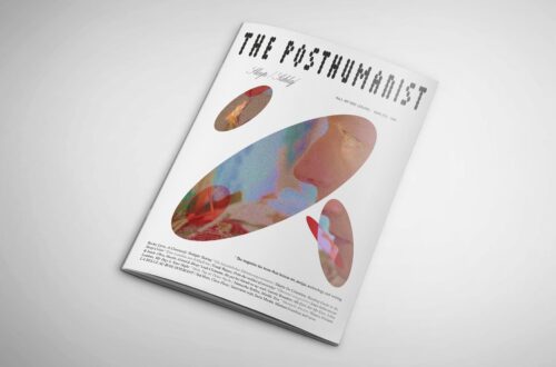
The Posthumanist magazine explores the universal theme of sleep in debut issue
November 21, 2022
BL8D explores mortality in brand new third volume
March 29, 2025