INQUE magazine launches ten year print odyssey
It was in summer 2020 when INQUE Magazine landed on my radar via Kickstarter. A fresh new take on the magazine format, INQUE aims to release one issue a year for ten years and then stop. INQUE comes from the minds of Matt Willey (previous The New York Times magazine art director and current Pentagram partner) and Dan Crowe (founding editor of multiple magazines such as Port, Avaunt, Zembla and Butterfly). The two of them have multiple awards and credits behind them; their work together on Port and Avaunt was a triumph both editorially and as stand-outs on the shelves. Although Avaunt is no longer in print, Port’s recent re-design by Matt continues to impress with issue 29.
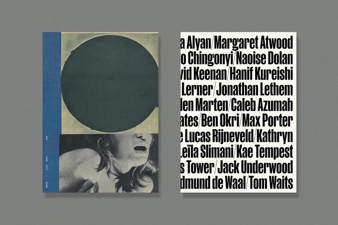
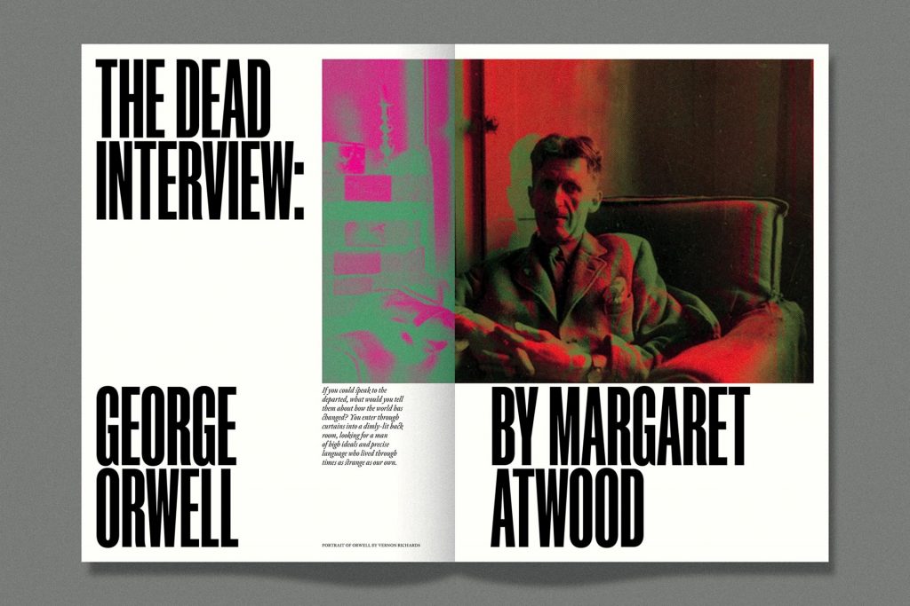
INQUE’s large format design is an exclusive project which aims to be an “experimentation” of sorts, as noted by Matt in a recent online conference interview. With no digital version it will also run no advertising in the pages – making it as independent as it comes. Their website notes it be “dedicated to extraordinary new writing,” working with the likes of Margaret Atwood, Octavia Bright, Steven Heller, Hanif Kureishi, Kathryn Scanlan and Kae Tempest, to name a few. With this standard of line-up on the first issue alone, it sets a huge president for future issues – an exciting thought!
As one of the most anticipated releases this year, INQUE finds itself on the precipice of a journalism journey of a lifetime – although just for ten years. Its inaugural issue comes in at 232 pages and only 6,000 printed, making it extremely limited edition. As time evolves (over a year since the campaign) so does the idea and execution. At 340 x 245 mm it is slightly smaller than the successfully funded Kickstarter notes, however the page count has risen from 192 pages to 232.
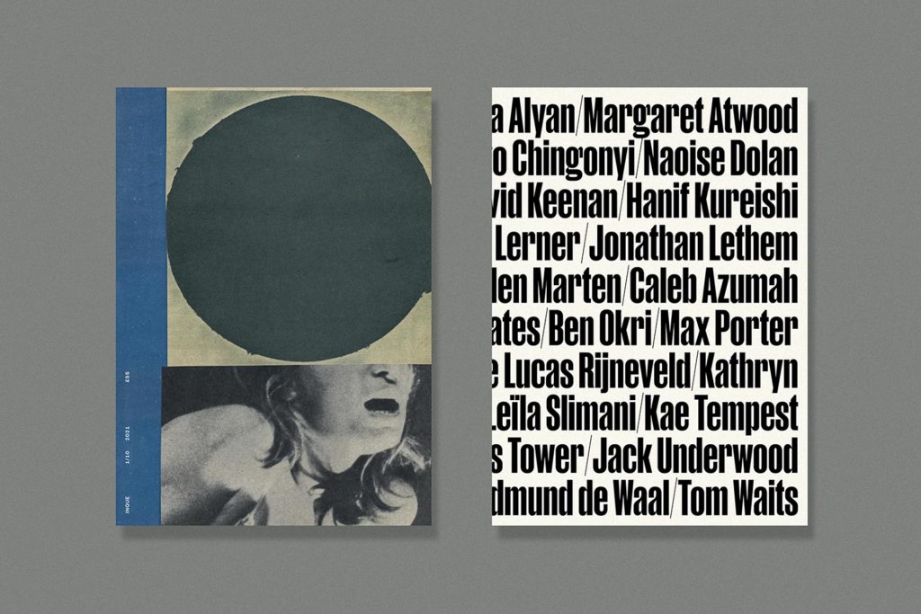
The front cover of the first ever issue is a collaboration with Katrien de Blauwer, a Belgium-born “photographer without a camera” as she notes on her site. Her art is reminiscent of photomontage and further notes on her site the vision and interpretation of her pieces. “The collage effects a kind of universalisation, emphasizing the impossibility to identify with a single individual, yet allowing to recognize oneself in the story. The artist becomes a neutral intermediary: without being the author of the photographs, she appropriates and integrates them into her own interior world, a world she’s revealing in third person.”
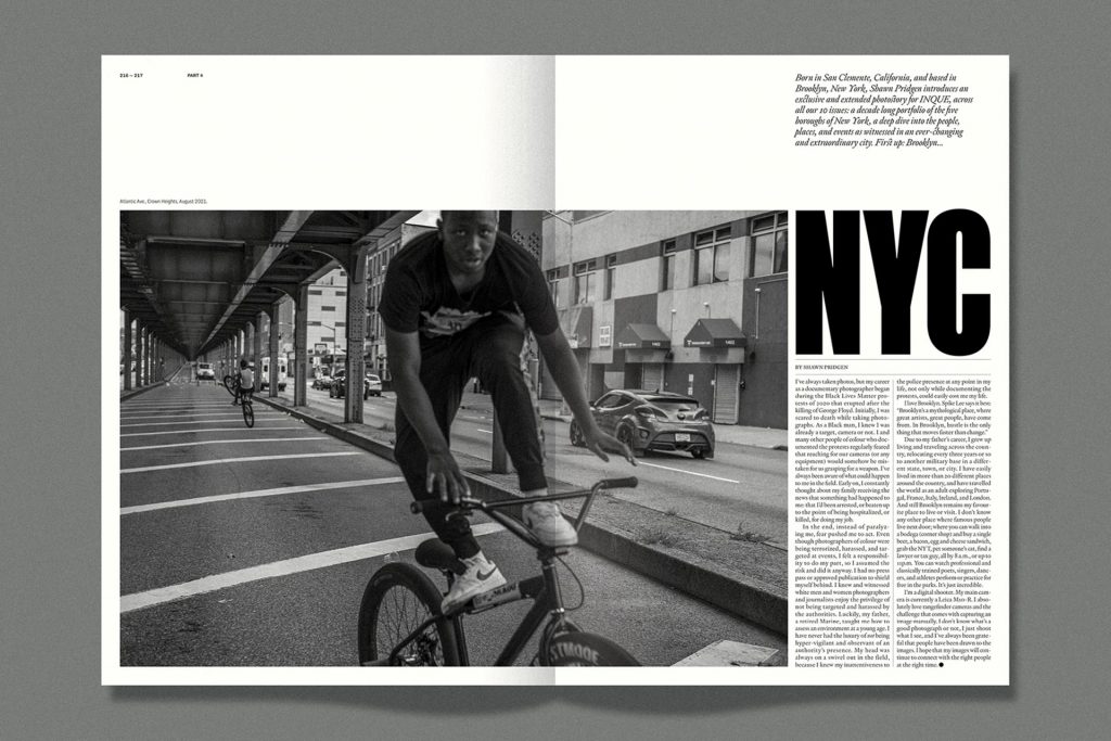
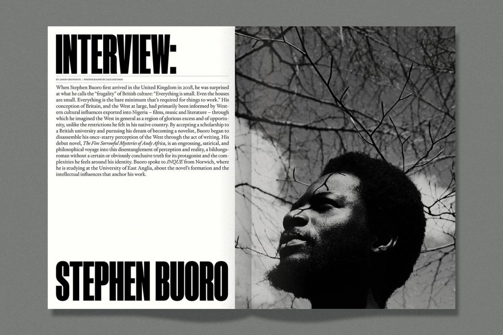
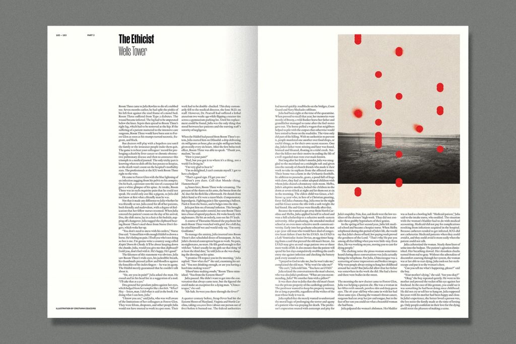
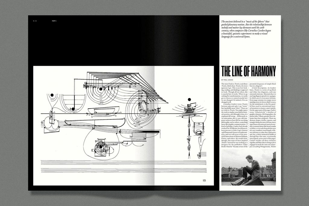
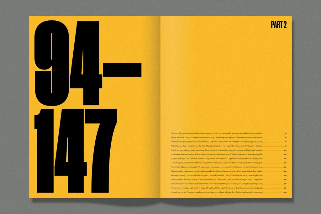
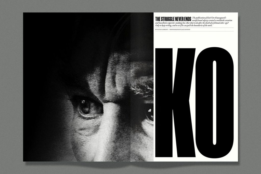
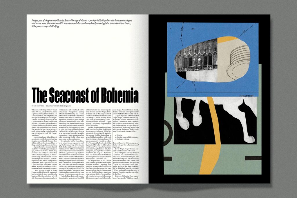
With a heavy visual collaboration adorning the cover, the inside contains a diverse range of layouts – using bold sans-serif headline text to punctuate the message of each article. The ‘Part 2’ chapter spread is a dominant force within the publication, using a strong yellow to balance the black, large headline text noting the page numbers “94-147”. Photography throughout is used to compliment the pieces with the black and white works becoming meshed with the black text throughout. Although coloured images are used too, each article visually decides on the image – or demands its usage. This considered approach makes INQUE a unique visual and literary journey for the reader, and one you should look to discover for yourself.

Enjoying Overleaf? Support independent journalism by donating here. Overleaf is the fully independent blog and podcast (coming soon) of Stuart Williams, a writer, designer and artist currently residing in Finland. If you’d like to become a supporter, please email here. You can also follow Overleaf on Facebook, Twitter and Instagram.