

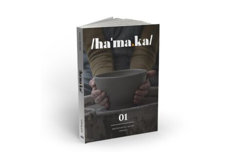
Between The Lines issue one navigates the tactile world of brand language


‘Between The Lines’ is a brand new magazine focused on the “massive (and misunderstood) world of brand language,” as noted on the front cover. Embossed and spot varnished, the leading name of the publication, set in near-black is positioned across the top and bottom of the cover, with the introduction sitting in the middle. A void of neon green is the dominant colour across the outside, joining a spiral-bound spine that invites you to start reading. Before diving in, we turn to the back and see ‘clarity, character, community, continuity’ sitting stacked vertically at the top in the same embossed design. The size is an intriguing 130 x 210 mm, making it a mini-book that is the ideal size for a workspace or on-the-go.
Created by the founder of ‘verbal branding studio’ Opening Line, Zosia Swidlicka, ‘Between The Lines’ starts a discourse about the importance of brand language and asks the question, “what does the future look like for brand language?” amongst others. In collaboration with Extract Studio, Zosia has compiled a diverse range of interviews from industry leaders, whilst punctuating the magazine with quotes from others in the brand world. “We believe that language is the most underestimated tool for standing out. But to stand out, you have to know what you stand for.” This paragraph sits within the introduction on the first page, positioned in the bottom right of a largely empty space. This is in reference to the agency but also reflects the values of the magazine – opening up the discussion about language.
‘Editor’s Letter’ is a card divider sitting across roughly sixty percent of the page underneath, acting as a chapter marker. The same typeface as ‘Between The Lines’ on the cover, this is set in a large size in white on a black background – a simple, uncluttered visual. The same can be said across the main letter itself, instead with black on white and a green highlight for emphasis on wording. Over 22 pages we read the full letter, sprawled across the white page, acting as a canvas for typography. The rhythm develops for each statement, from single sentences positioned neatly in the top third, to the ‘express an idea’ post-statement arrow arrangement, adding an instructional flow on how to express – “clarify it. Improve it. Elevate it. Organise it. Sell it. Live it. Repeat it.” They also say it themselves on the next spread with “playful punctuation!” It is this design that stretches the letter across this length of pages, but digesting this advice is best served with strong and playful punctuation; adding memorable moments through layout.
Without revealing this vital advice, we lead into the end half of the letter to a section of text explaining the publication’s setup. “We’ve split our thinking across four chapters; each representing a guiding principle that we at Opening Line believe brand language serves to do, and what we work towards every day.” The voices feature a range of people “at all stages in their careers. Not just those who’ve already made it.” The interviews with the various guests don’t have a strong indication of the level in their career other than their bio – containing their name and job descriptions. Without prior knowledge of the company name and their degree of distinction, we position each of the guests as notable experts, providing key insight into the industry.
Stuart Williams, Owner of Overleaf
The end of the letter we see the primary green used on the front cover, but acting as an ending piece showing a photo of Zosia, the Founder. On the other side, we see the first flare of ornamentation – some hand drawn characters devised in brushed ink from appearance. The black ink is used in a considered but also rough manner, making it feel like it had to be only made through a hand – not an AI machine. This is also in reference to the craft of brand language, which is facing certain pressures by large AI software as of the past few years – later referenced in an interview in the magazine. The chapters open in this manner, however, with these almost surreal characters upon the green, with the adjacent containing a chapter numerical marker on black card – similar to the ‘Editor’s Letter’ but half the size. We have this positioned in the bottom fifty percent of the main page behind it, containing the chapter name. Quotes from guests are positioned next, before opening us into the main interviews – giving us some fun, punchy, memorable ideas, devices and almost poster-esque quotations to kick-off the chapter theme. The type of quote you can imagine seeing on a large Anthony Burrill print – a staple in a lot of creative people’s interiors.
Get indie magazine news, reviews and events direct to your inbox! Simply sign up to the Overleaf newsletter on Substack and you’ll be the first to hear about new articles, podcast episodes and loads more.
“More balls, less bullshit” by Claire Baker is positioned across a double page spread in chapter two, with “balls” repeated five times on the green colour. This confident typographic-led design is a bold delivery, pairing with the distinguished brush marks of the illustrations throughout. In chapter one we dive into ‘Clarity: To know’, with two focused on ‘Character: To feel’, with others to follow including ‘Community: To belong’ and ‘Continuity: To unite’. Each of them have a large Q&A featured within, the first with Zuki Sedgley, a Writer and Creative Director. When speaking about the value that brand language can bring to a company and its audience, Zuki notes, “I fundamentally think that the purpose of brand language is to make things that you don’t understand understandable.” This holds true as advertising proves – but it goes beyond the use of a slogan. “We need to embrace its multiplicity – beyond tactics and taglines,” Zosia noted in the earlier letter. But Zuki also admits that “it’s really hard to write,” and should be focused heavily upon decision-making, from the writer or the client. “People talk a lot about how ChatGPT can take on the role of a copywriter,” they add. “But to me, the big difference that people make is that act of choosing.” As artificial intelligence develops, more opportunities may arise – be it helpful or detrimental to the process. Zuki holds the opinion of the future already being in motion – an inevitability that they admit that they can’t see a “reason why a Large Language Model can’t write copy.”
In chapter two we pick on the idea of trust building within brand language, a point added within the interview with Seun Areoye, Editor of GAUCHOWORLD. “I buy from certain brands because I trust this brand, because of the message they’ve sent to me over time.” This prolonged relationship with brands is not a new concept, but highlight this encourages further questions such as “what’s important to the people that love your brand?” and “how are you speaking about those things?” – adding a level of depth to the thinking behind the trust. Strengthening this relationship is a key builder of engagement, but Seun also admits that “sometimes brand language can be a bit too focused on the brand, which sounds kind of silly, but I think it almost needs to be focused on how the brand shows up in other people’s lives.” This feeds into the element of community, the core theme of chapter three out of the four divisive branches of ‘Between The Lines’. “[Brand language is] something that unifies and allows you to signal who you are, whether that’s internally or externally,” Ayo Fagbemi from Explorers Club Studio notes.
One of the key questions that Ayo brings to the table is the execution of more conversations between designers, strategists and writers – “how do you create a space where both sides can have an equal conversation about ideas?” It’s this insistence on the importance of having this equality that punctuates the middle of the interview, building into the concept of “value exchange” – enabling us to “learn a lot more about the space” therefore learning “more about ourselves.” AI is also discussed and Ayo notes the conversation about AI as being “very passive.” They continue, “it’s really important for us to remain active and keep asking what we can do, versus what will happen” – further adding that inevitability that Zuki earlier referred to.
Chapter four is the penultimate phase of ‘Between The Lines’. “Brand language is about what’s right for the brand, not about how clever the writer is.” This quote by Emily Penny from Becolourful is a stark reminder of the core purpose of brand language, but removes the ego out of it. The last interview that follows sees us meet Ashley Johnon, Head of Brand Narrative at Pentagram Design. Pentagram is a global agency with headquarters in New York and London. With multiple partners leading teams across all parts of the design process, they’ve been involved in some of the largest branding projects in the industry, arguably shaping culture through design for decades. Famous projects include Paula Scher’s rebrand of Mastercard and Ashley’s work under Marina Willer for Battersea – a huge charity in the UK for homeless dogs and cats. These are to name a few, with many compendiums published showcasing the history in a lot more depth than what can be added here.
Ashley reminds us that brand language is “all about establishing a relationship with a person” – similar to “dating” they add. “If you don’t see brand language at any given moment, it’s intentional,” they continue, adding that the audience timespan for reading is low. But if the “strategy is right, then there’s a huge unlock that happens” – this unlock relates to the creative vision behind the language, allowing them to take it forward both in design and in language. Ashley goes on to mention that “brands want to spend less money on this stuff,” in reference to communicating through brand language. They note that there is value in upskilling internal teams, “so that you can sound more consistent from the beginning and over time as well.” In understanding and implementing this approach this may remove funds from the pot, but Ashley maintains that the relationship of brand language is “[a] foundation and why the strategy is so important to starting the language.”
Intentional design is a foundation also for the publication, that uses a strong editorial approach from the start to the close. An engaging editor’s letter that uses layout and truncation to get their message across is rare – as many use the fully justified styling of paragraphing to insert into the page. Personality immediately bursts into view through the design, telling us that this is a trusted source of inspiration, knowledge and insight. The bold typographic and illustrative chapter markers shout loud with purpose with the message dialled down to digest the long form interviews that hold decisive advice from the trenches, so to speak. We learn what brand language can bring to the conversation and open up a world of potential, breaking through the usual clutter of design blogs full of advertising and clickbait to offer true value, consideration and a depth of understanding that leaves a mark. The evolution of the brand language discourse can’t and shouldn’t be held within a single issue; the anticipatory effect applies to such a publication whereby there is a huge trajectory set across the many branches of brand language.
Here are the stockist websites for this magazine title. These may include social media links only.
Opening Line – Instagram
magCulture – Official Website
Correct at time of writing.
Advertise your goods or shop here! Contact Overleaf via overleafpodcast@gmail.com with the subject line ‘Article Sponsorship’ to find out more.

| Cookie | Duration | Description |
|---|---|---|
| cookielawinfo-checkbox-analytics | 11 months | This cookie is set by GDPR Cookie Consent plugin. The cookie is used to store the user consent for the cookies in the category "Analytics". |
| cookielawinfo-checkbox-functional | 11 months | The cookie is set by GDPR cookie consent to record the user consent for the cookies in the category "Functional". |
| cookielawinfo-checkbox-necessary | 11 months | This cookie is set by GDPR Cookie Consent plugin. The cookies is used to store the user consent for the cookies in the category "Necessary". |
| cookielawinfo-checkbox-others | 11 months | This cookie is set by GDPR Cookie Consent plugin. The cookie is used to store the user consent for the cookies in the category "Other. |
| cookielawinfo-checkbox-performance | 11 months | This cookie is set by GDPR Cookie Consent plugin. The cookie is used to store the user consent for the cookies in the category "Performance". |
| viewed_cookie_policy | 11 months | The cookie is set by the GDPR Cookie Consent plugin and is used to store whether or not user has consented to the use of cookies. It does not store any personal data. |