On The Overleaf Shelf: September 2021
The first edition of “On the Overleaf shelf” features a range of limited edition risograph magazines published in Helsinki, to a brand new re-design of a beloved classic hailing from the BFI. It’s been a crazy summer for publishing, with some popular titles leaving us (‘Scoop’) whilst others thrive with early editions selling out in record time. I’ll cover the ‘Scoop’ story in another article but here’s what I’ve been buying over the summer period.
Main blog image credit: Pentagram
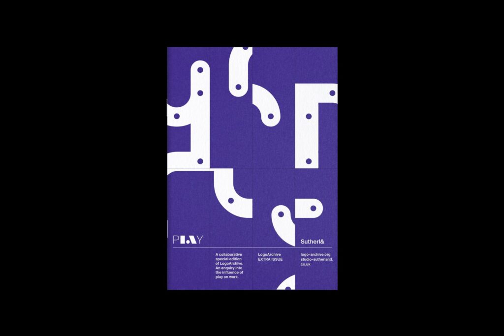
1. LogoArchive Extra Edition ‘pLAY’
Since its hugely popular ‘Akogare’ edition (which won a D&D Award), LogoArchive have been keeping us on our toes with new extra edition ‘pLAy,’ a purposefully playful name to match the nature of the publication. Designed by Jim Sutherland of ‘Studio Sutherl&’, this 12-page world merges work and play into an interactive, educational and delightful experience.
The brainchild of designer, writer and publisher Richard Baird, LogoArchive continues to be a striving force in the mission to showcase long forgotten design gems. From his shop there are a wide range of rare brand identity books on sale, as well as zines and of course the main zine itself which has sold out upon each release. If anyone finds any spare copies on sale anywhere, let me know! The brilliance of the family of zines created is unmatched in its craftsmanship of the medium but also in its in-depth research that sees us experiencing some of the work for the first time, or being reminded of times past. This balance of historical reference contrasted with the relevancy of the designs today merges into a dynamic zine that extends the life of each identity in the reader’s mind; a hard feat to achieve in this day and age.
Go pick up a copy of the new extra issue:
LogoArchive Extra Issue ‘pLAy’
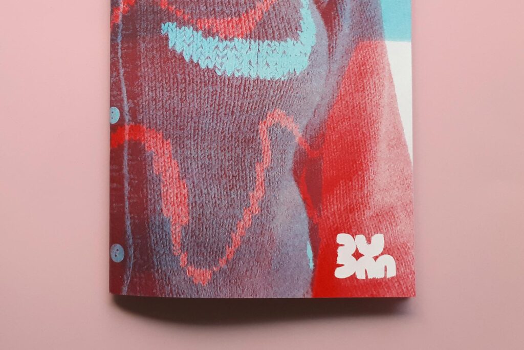
2. BUM Editions 1, 2 and 3
A relative newcomer to the printed world, BUM Editions look to use their tactile medium to highlight some key subjects in design, architecture and others. BUM Editions are limited edition magazines with a wonderful edge – they’re entirely risographed. Successful zines such as Counterpoint have also made their name in the industry through risographing their pages, and BUM is no different. With a dynamic design which invites the user to interact, BUM looks to use their medium to the full effect, culminating in a unique publication that is highly tangible and collectable.
The small creative team behind the zine is based in Helsinki, Finland, whilst the printing is sourced to Jemini Press in Sweden. They’re currently doing an open call for artists for their issue 5, on theme of ‘Enough.’ Deadlines close September 13th 2021.
Visit: BUM Editions
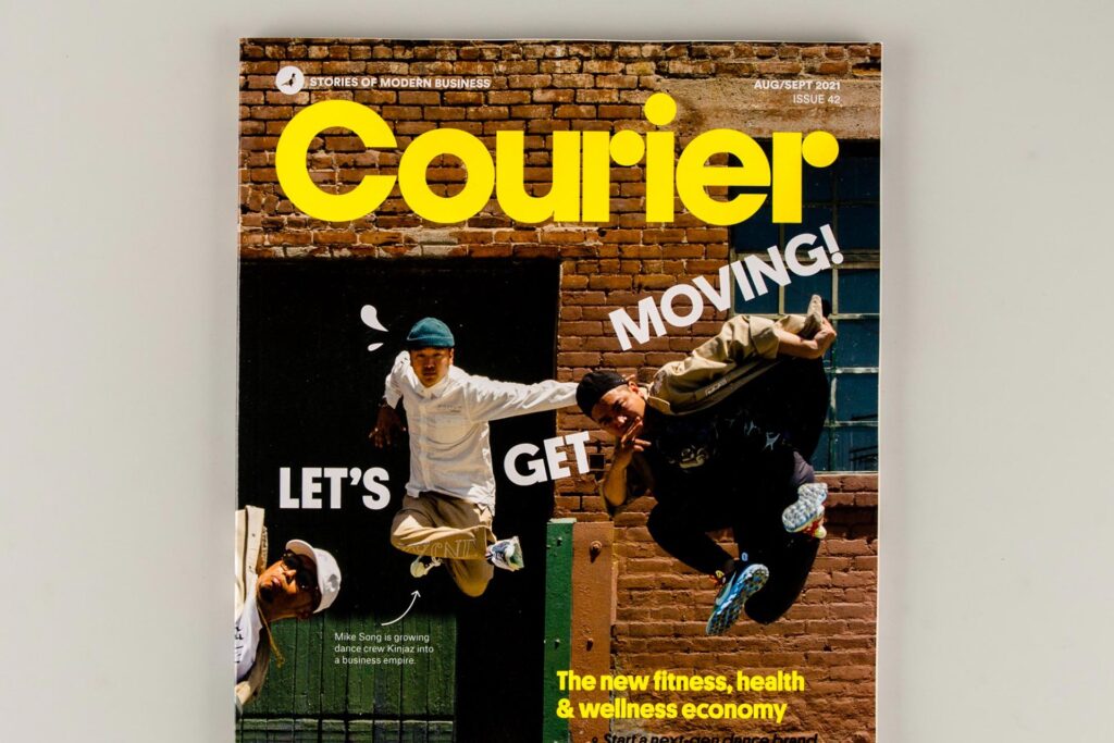
3. Courier issue 42
“Welcome to the active economy,” Courier’s website quotes, highlighting their brand new issue 42. As a reader since their very early days (issue 8 I believe), Courier have continued to delight and inspire their business-themed audiences across the globe. With new offerings including a full-length book ‘Work Better. Live Smarter. Be Happier’ and guides such as their new ‘100 ways to make a living’ (part of the ‘Inspire to action’ series) release, they’re going from strength-to-strength.
Issue 42 delves into the health and wellness economy, exploring the various brands making waves in the fitness industry. Courier notes, “Check out the future of the booming Indian sportswear sector, discover tons of new fitness brands doing things differently, and see how forward-thinking dance studios are making a killing in media, apparel and even food and drink. Plus, learn about the daily routine of a modern, influential yoga entrepreneur, how to nail a collaboration in the sports sector, what it takes to launch a recycled surfboard brand, and why now’s the time to start a sauna company.”
With each issue comes a different theme within business, talking to the people behind the brands and how they’ve progressed within their sectors. Courier has re-designed the way we consume business and start-up news; every issue offers a refreshing perspective on both guidance and real case studies. A positive force in magazines for the modern age.
Visit: Courier
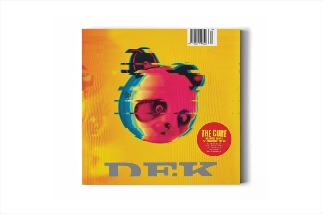
4. Dek issue 3
Square format music magazine Dek is designed to impress. This specific issue sees The Cure’s Robert Smith curate a special dedicated to the band’s 1996 album ‘Wild Mood Swings,’ an album that “sold well but somehow failed to find its way into fans’ affections,” Dek’s website reads. An epic 35-page feature reminisces on the underrated album, releasing rarely seen imagery of the recording process. It’s a special issue for any The Cure fan, like myself.
Released early summer, issue 3 follows a popular issue 2 featuring Manchester’s Doves, a band who are also a favourite of mine. There’s something to be said about focusing on specific influential bands in each issue, resonating with individual fan bases across the world. With music magazines such as ‘Q’ leaving the shelves in recent times, ‘Dek’ looks to revitalise an industry by providing a fresh look on these crucial bands, whilst staying true to the format.
Visit: Dek Magazine
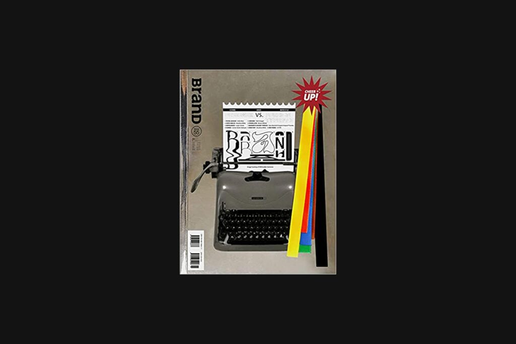
5. Brand issue 55
Brand is no stranger to overt, over-the-top covers, and issue 55 is no different. An intriguing mix of experimental cover designs that works with the issue’s message and a highly engaging sense of interactivity with each issue, Brand is a step ahead. Issue 55 looks to continue their unique features and explore a unique chapter identifier – judo rankings. Each chapter is introduced by a papercut belt with text reading the rank or grading levels and the type of content in each chapter, i.e. ‘Type design, green belt.’ This is further emulated by the series of ribbons attached on the front cover, showing all the coloured rankings with a badge reading ‘Cheer up!’
Within the theme of the relationship between “designer and foreign typefaces,” each chapter explores the progression within type design – from preparing a typeface to professional usage. It features a wide range of strong typographic examples and interviews with custom type designers – giving a breadth to the subject. Another great example of how creative concepts can be introduced to more serious themes.
Visit: Brand Magazine
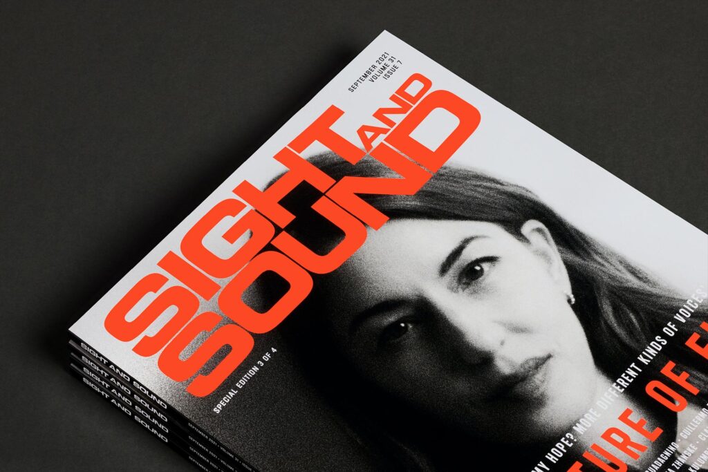
6. Sight & Sound volume 31 issue 7
Bringing the cinema to the magazine format has been Sight & Sound’s goal for the past 80 years. A huge legacy that ever-evolves, the BFI’s Sight & Sound have launched a re-designed issue with their latest effort. Designed by the team over at Pentagram, the re-design takes inspiration from their 1970’s logo look and feel, whilst keeping the integrity of their respected voice within the industry.
Developing upon a legacy spanning 80 years is no easy task, but Pentagram has brought a new dynamism to the writing. Using various paper types, the design agency has given the reader a tactile experience to the different sections within the issue. Launching the re-design with four different covers including Chloé Zhao, Steve McQueen, Sofia Coppola and Luca Guadagnino, readers can pick and choose their favourite. The issue with Chloé on the cover is now in my collection this month.
Visit: Sight & Sound