L.A. Signs zine series captures the City of Angels like never before across ten volumes
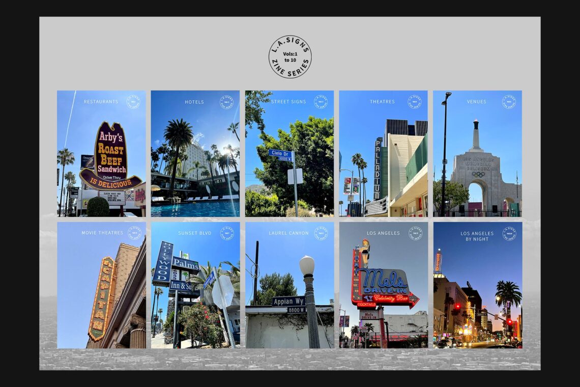
L.A. Signs is a series of ten zines created by Paul Price, an independent book and zine publisher from West Yorkshire, England. The staple bound volumes come individually packaged with a postcard full-colour image from the specific volume, as well as a leaflet containing the full series information. The 32 page, A5 zine holds Paul’s very own imagery of iconic buildings, street and neon signage from the city of Angels – Los Angeles, USA.
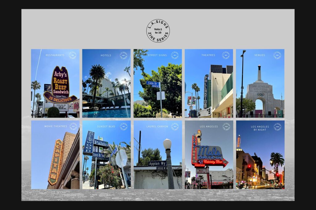
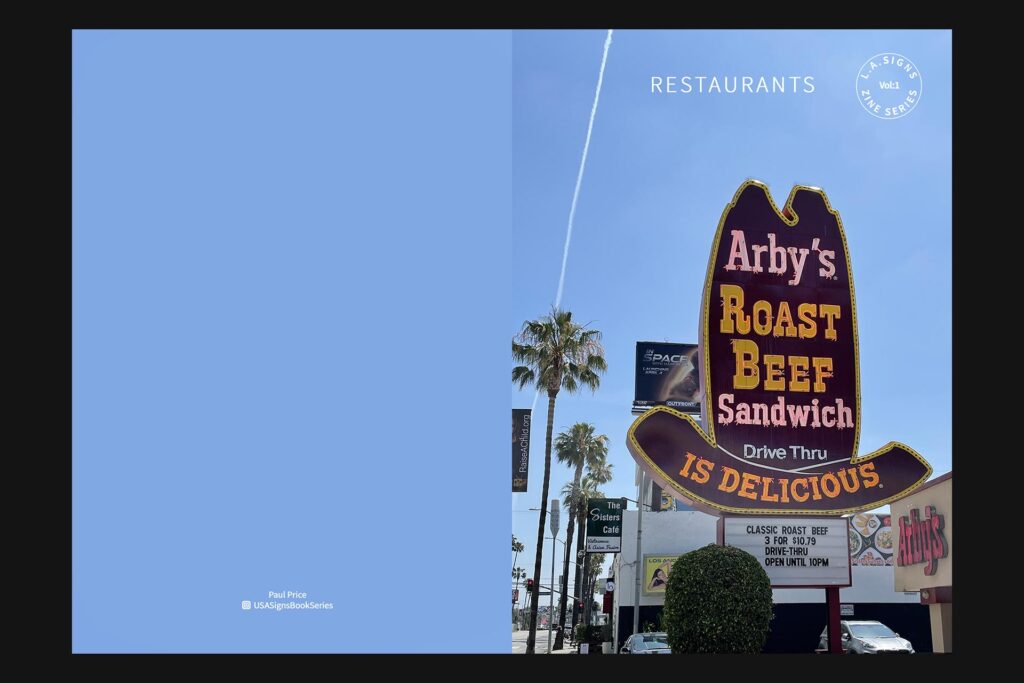
The full series in order includes Restaurants, Hotels, Street Signs, Theatres, Venues, Movie Theatres, Sunset Blvd, Laurel Canyon, Los Angeles and Los Angeles by Night. Volume one sees Paul visiting Restaurants, with the main image adjourning the cover being Arby’s Roast Beef Sandwich Drive thru restaurant. The sign is positioned within a large brown hat, similar to one used in Wild West movies. Multiple signs surround it but the scale of the hat with text dwarfs the others. The sky is a notable element as it’s continuity is held across all zines in the series and the same blue shade is found upon each leading image on the covers. Piecing them all together would create a skyline of sorts – one that resembles the most famous skylines of all time.
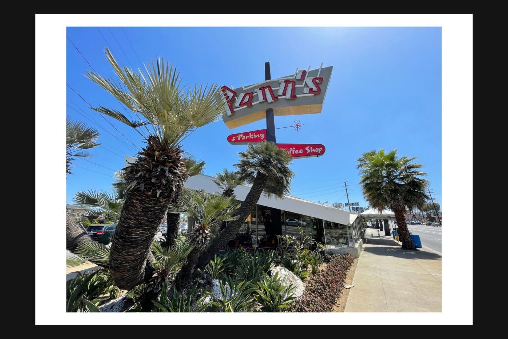
Inset we encounter a range of imagery; all notable Restaurants in L.A. Some contain borders and some take the full width and height of the pages, giving full impact. None provide insight into the quality of the food, service or otherwise – the reader relies solely on face value, viewing the images as you would in a gallery or exhibition space. As the imagery is themed on signs, their huge scale shown across the zine is made to be attention-grabbing, hoping for motorists to stop and eat. Paul seems to offer readers a walking tour of sorts, with views of the signs varying from directly underneath, across the street or mere metres away from the entrances.
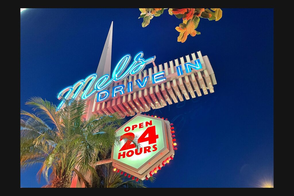
The first image we see visits Pann’s, a sharp and angular sign hosting a jostled red logo. Smaller, rounded signs for the coffee shop and parking area are held beneath the main piece. The restaurant has served the people of L.A. Since 1958, accompanied by their slogan – “Where Good People and Good Food Naturally Come Together.” The postcard image from volume one is also seen on the next double page in the zine. Showing Mel’s Drive-in, this 1947 “American Classic” also boasts a 1950’s menu to match Pann’s, in-keeping with the heavy use of neon signage. The image itself is set upon a deep blue sky, adding a high contrast between the background and the signage next to a palm tree.
The next time and only other time this high contrasting dark blue appears is in the image with Musso & Frank Grill, closer to the center-fold of the zine. Serving since 1919, this restaurant is noted as the “oldest restaurant in Hollywood”, the image reads. The shot is positioned with the lense facing upward using a wide angle, giving the trees in the image a strong central perspective. The vibrant orange of the building in view gives the white logo and text a clean, almost modern look and feel. The small shadow underneath the signage gives the orange wall depth and places the viewer firmly in Paul’s place, seeing what he’s seeing. The larger sign is seen with the palm tree, much higher than our position, and only shows a portion of the full piece. It’s clear that to get a full view, there’s some distance required and some can potentially be overlooked by the everyday customer.
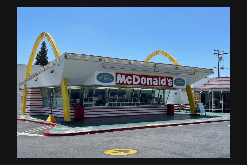
Towering above the venues, these signs help build a picture of the restaurants that are noted as a hundred years old, or close. These signs are therefore held in high regard in terms of the heritage of Hollywood and surrounding areas, as part of its ever-expanding heritage. As described by the BBC here, L.A. Is noted “as hard to define as it is to navigate without a car. A sprawling urban mass covering 500 sq miles (1295 sq km), it was famously described by Dorothy Parker as ‘72 suburbs in search of a city’.” Within a sea of corporate branded chains as is usual with a popular tourist destination, the likes of McDonald’s and In-n-Out Burger are shown in the zine. There are family-owned restaurants featured however, adding that suburban community feeling.
Images such as Pink’s, Canters and Hugo’s remind of the point and shoot camera style as seen with disposable cameras, but Paul’s imagery all seem to be digital. A balance can be seen between the clean corporate image and the more decorative heritage brands using neon typography to full effect. The neon is sometimes used as a nod to the past, bringing that 50s and 60s American diner feel forward into the present with an air of nostalgia. But this also gives the viewer a flavour of how the skyline across L.A. Looks today as a means of documenting communities and a small portion of the restaurant industry. With ten volumes all available now, each looks to give the reader a clear view of the landscape of Los Angeles, giving insight away from digital media – almost transcending the time of when some of these signs were made and first stood. There is history and craftsmanship on display here, with signage withstanding the pressure of time. But we also see them through Paul’s trained eye, looking at the signs from a fresh perspective or for the very first time.
Overleaf recently interviewed Paul about the LA. Signs project. You can read the full interview below.
Why did you choose Los Angeles as the primary location?
Looking back I’ve had a fascination with Los Angeles from a young age. Growing up in the North of England late 1960s early 1970s some of my first memories were watching imported children’s television shows for the USA. Then in the mid 1970s watching US detective shows mainly based in Los Angeles like Columbo and The Rockford Files.
I’ve always been intrigued by the neon signage that were on almost every building in those shows. When the opportunity to create a zine series presented itself, it seemed like the natural thing to do.
With so much heritage on display, do signs in L.A. Almost act as landmarks in the present day?
Good question – I think yes they do. Some of the signage in L.A is in fact more famous and recognisable then the actual buildings they represent.
"Some of my first memories were watching imported children's television shows for the USA. Then in the mid 1970s watching US detective shows mainly based in Los Angeles like Columbo and The Rockford Files."
Paul Price, ‘L.A. Signs Zine Series’ Author, Photographer and Self-publisher
What timeline were the images taken? Do they span a long period of time?
The first set of images for the L.A. Signs Zine series were shot in April 2022 when I was over there on holiday in Los Angeles. This was the first time I had really taken photographs so was very pleased how they turned out. I returned in April 2023 to get more photographs for the series.
Whilst photographing the signs in volume one – Restaurants, did you discover anything surprising about the signs, or their surroundings?
The most surprising thing was the actual size and detail of some of the signage. For instance the Bob’s Big Boy Sign from their Burbank location is 70 feet tall. It was designed and constructed in the 1930’s and still looks great today.
What equipment do you use for the photos?
To capture all the images used in the zine series I used an iPhone 14 Pro camera phone.
Overleaf email newsletter - subscribe for free today!
Get indie magazine news, reviews and events direct to your inbox! Simply sign up below and you’ll be the first to hear about new articles, podcast episodes and loads more.
Do you have a favourite from the set of zines?
I don’t really have a favourite set in the series but I do have favourite images from various volumes. I’m thinking about publishing a Best Of L.A. Signs Zine in the future and most likely use my favourite images in that.
The free postcard that arrives with the zine, was this homage to the travel aspect?
No not really, more to showcase the photograph from the centre page.
How was the photo curation process? Did you have to cut out some?
I had almost 6,000 photographs from my April 2023 visit to Los Angeles, so sorting through them was a lengthy process. I sorted through them to find the best photographs but obviously some images got left out of the final zines.
None of the images have a location or date attached. Why was this?
I wanted the Zine Series to have a minimalist design just focus on the photography, no text but it is something I am considering using in the Best of Zine.
Will the images be physically viewed in a gallery in the future?
There is nothing planned but it’s definitely an ambition of mine to have my images shown in a gallery.
You’re selling all the volumes as a set and individually, do you ship globally from your own site?
Yes, all volumes are available from https://lazineseries.bigcartel.com with shipping worldwide.
Is there more to come after Los Angeles?
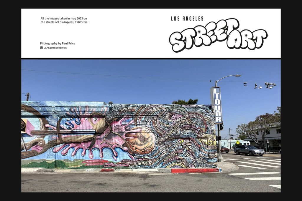
In addition to all ten volumes of L.A. Signs, two stand-alone zines I’ve done, Venice Beach and L.A. Street Art, are now on sale. In the future, I hope to publish a perspective of London zine, with images from my recent visit to London and a new zine series focusing on 1970s culture in the UK.
Where are the zines stocked?
My own store on Big Cartel and at [a range of stockists – I’ve added them below].
Where to buy
Here are the stockist websites for this magazine title. These may include social media links only.
L.A. Signs Zine Series – Official Store
Magculture, London
Magma, London
Shreeji Newsagents, London
The Photographers Gallery, London
Parallex, London
The Photobook Cafe, London
Burley Fisher Books, London
Unitom, Manchester
The Modernist Shop, Manchester
Rare Mags, Stockport
Rova, Bristol
Good Press, Glasgow
The Library, Dublin
New Bridge Books, Newcastle
La Biblioteka, Sheffield
Chandel, Barcelona
Cahier Central, Paris
Correct at time of writing.

Enjoying Overleaf?


You May Also Like

Spotz and Racquet co-hosting ‘Tennis in NYC’ release party this August
August 5, 2022
The Floating Magazine’s posterzine is an ode to activism and creativity for the greater good
July 12, 2022